A peek into our design practice using historical grids
A Seaport Museum Blog
by Rob Wilson, Art Director, and Christine Picone, Designer at Bowne & Co.
October 16, 2021
At Bowne & Co., the Museum’s 19th-century printing office, we balance preserving traditional printing processes and contributing to contemporary design discourse. Our working collection of type, images, and printing presses is squarely rooted in the 19th century, but we make an effort to use it in contemporary ways with some of our projects. This is in part because the story of letterpress printing extends well beyond the 19th century, and also because as designers, we love to explore! Letterpress printing was a common production method into the 1970s, so we have the flexibility to explore avenues outside the 19th-century context: design philosophies evolve, but the process holds true.
When it came time to design a new series of notecards for our shop, we put a twist on an historical approach: we decided not to simply reproduce designs of the past, but to explore how design decisions might have been carried out during other eras in history.
We asked ourselves the same questions we almost always ask at the start of a project. How did we want the ultimate product to feel: friendly, or serious? Do we want the message to be easily understandable, or should the viewer be challenged? In this case, the answer to those questions was very simple: we needed more Thank You cards in our offerings, and the tone should be bold and playful throughout.
But with more than 1,000 fonts in our working collection, selecting typefaces for a project can be a major conundrum. Choosing imagery can be similarly overwhelming. Immediately we knew we had to vastly reduce the number of these choices at the outset. What if we designed our series using a predetermined system of images and types? What if we standardized other elements as well, like color and layout?
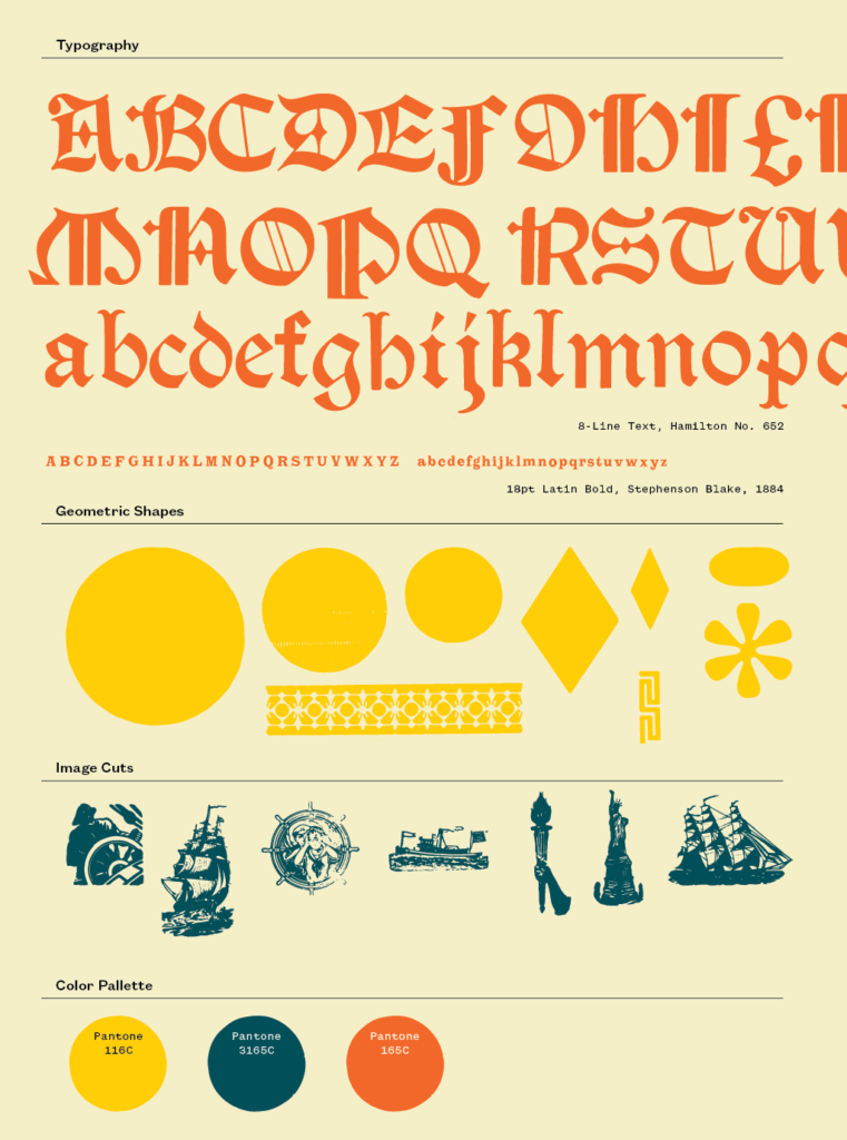
While it may seem paradoxical, building design systems with constraints can create a lot of space for exploration. Ultimately, we designed a system that allowed the use of 2 fonts, about half a dozen illustrations, a few geometric shapes, and a palette of 3 colors. For this series, we wanted to limit the other variables as much as possible so we could be more open and playful in one aspect: the grid.
Simply put, a grid is an invisible structure that helps a designer determine where type and images are placed on a page. And while they are most often associated with the rise of Modernism in the 20th century, the use of grids can be traced back to the very origins of letterpress printing. We decided to work with three grids which are famous in design history. Our design team consists of two people, so we decided that each designer should make a design using each of the three grids.
After setting up our design parameters, it was finally time to start working.
But of course, we couldn’t resist one last challenge. We decided to work in a charette, or design game. The goal was to generate as many different designs as we could in a limited amount of time. Working in Adobe Illustrator, we set up our grids and collected all of the available design elements. We each spent 30 minutes generating as many designs as possible for each grid. Then we critiqued the designs together, did an additional sprint of design based on that feedback, and decided which designs were the best expressions of each grid. These designs were fine-tuned over the course of a few days before moving into typesetting and printing.
Grid No. 1: “Gutenberg” Grid
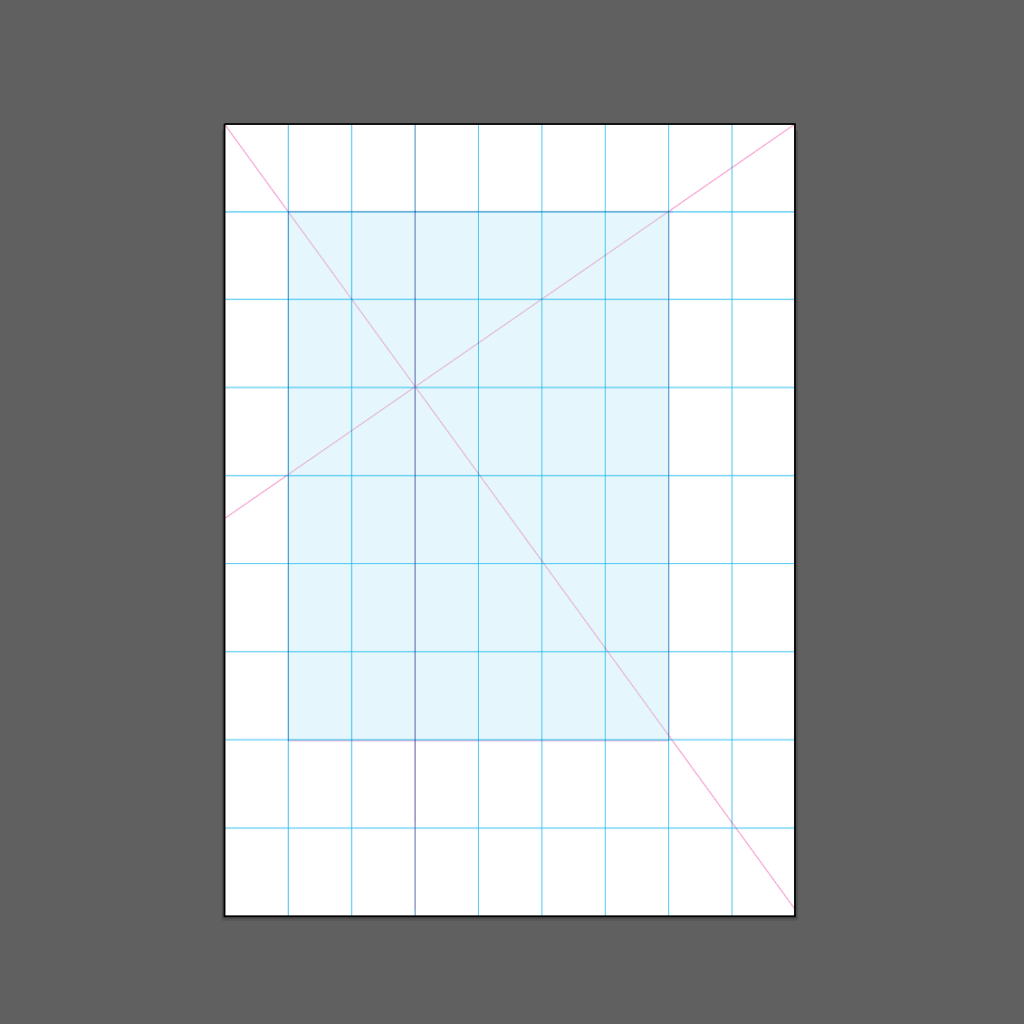
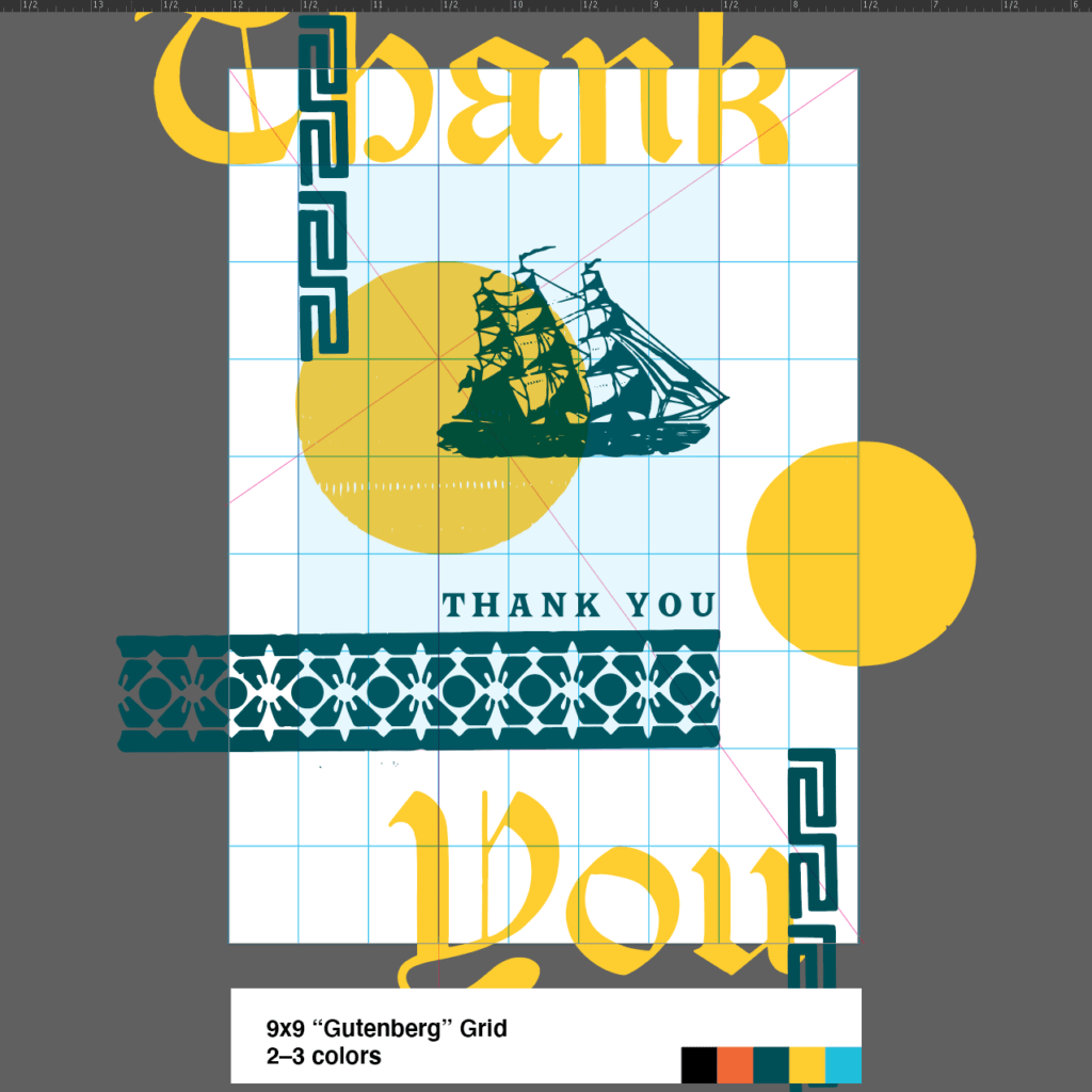
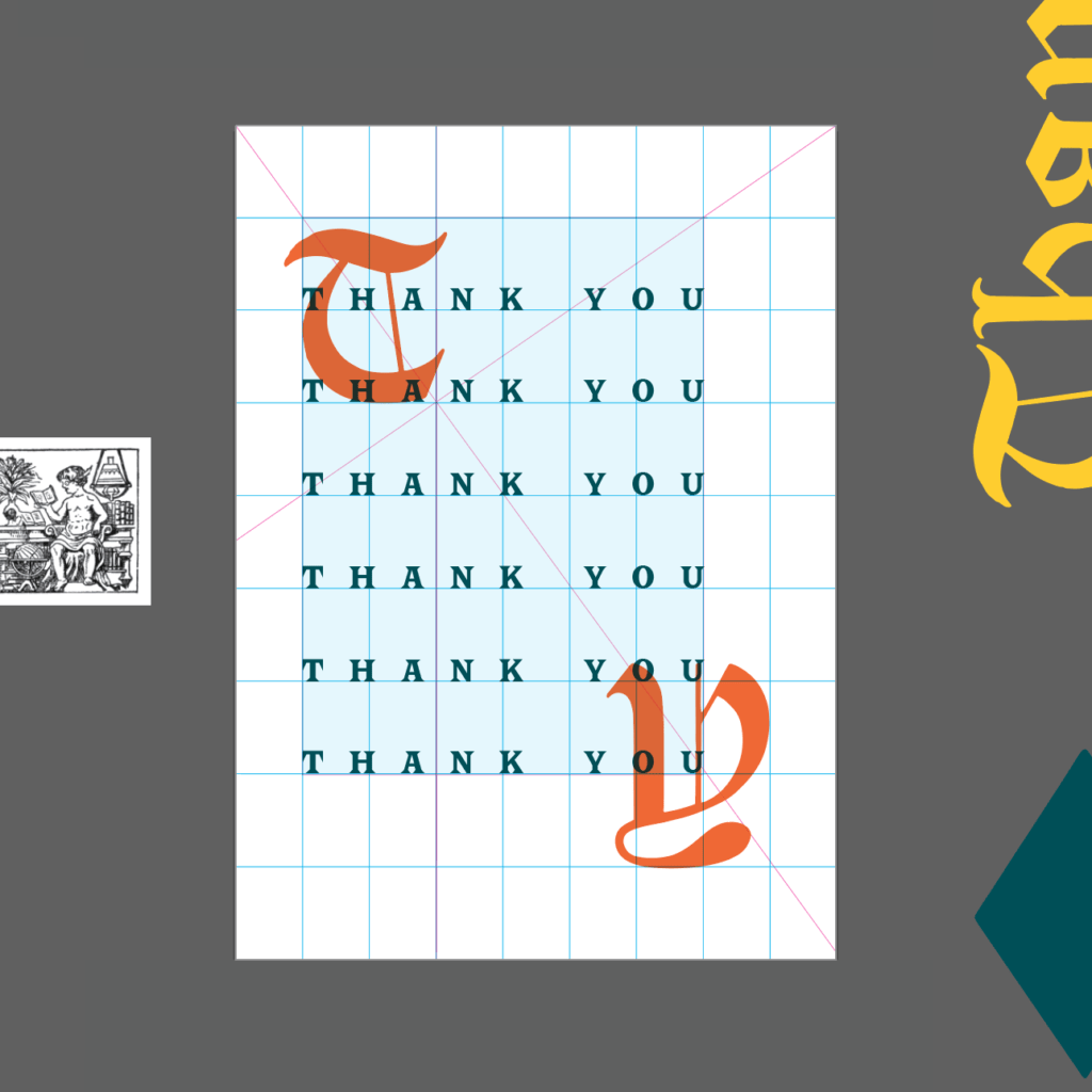
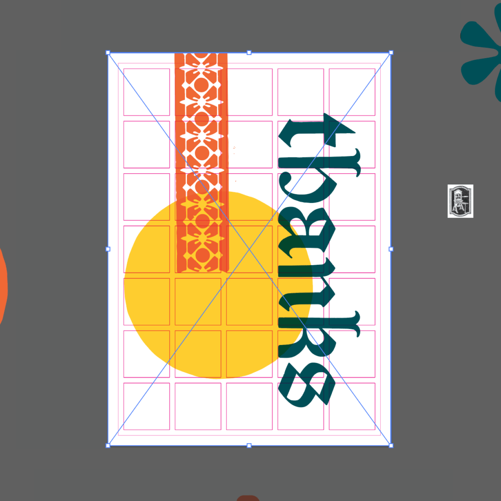
Our first card designs use a grid based on the golden ratio. It was developed in the 20th century from a study of some of the earliest printed books, including the Gutenberg Bible. In it, the page is divided into 9 equal units both horizontally and vertically. The text area allows for a wide exterior margin when used in book format and an asymmetrical focal point when used as a single sheet.
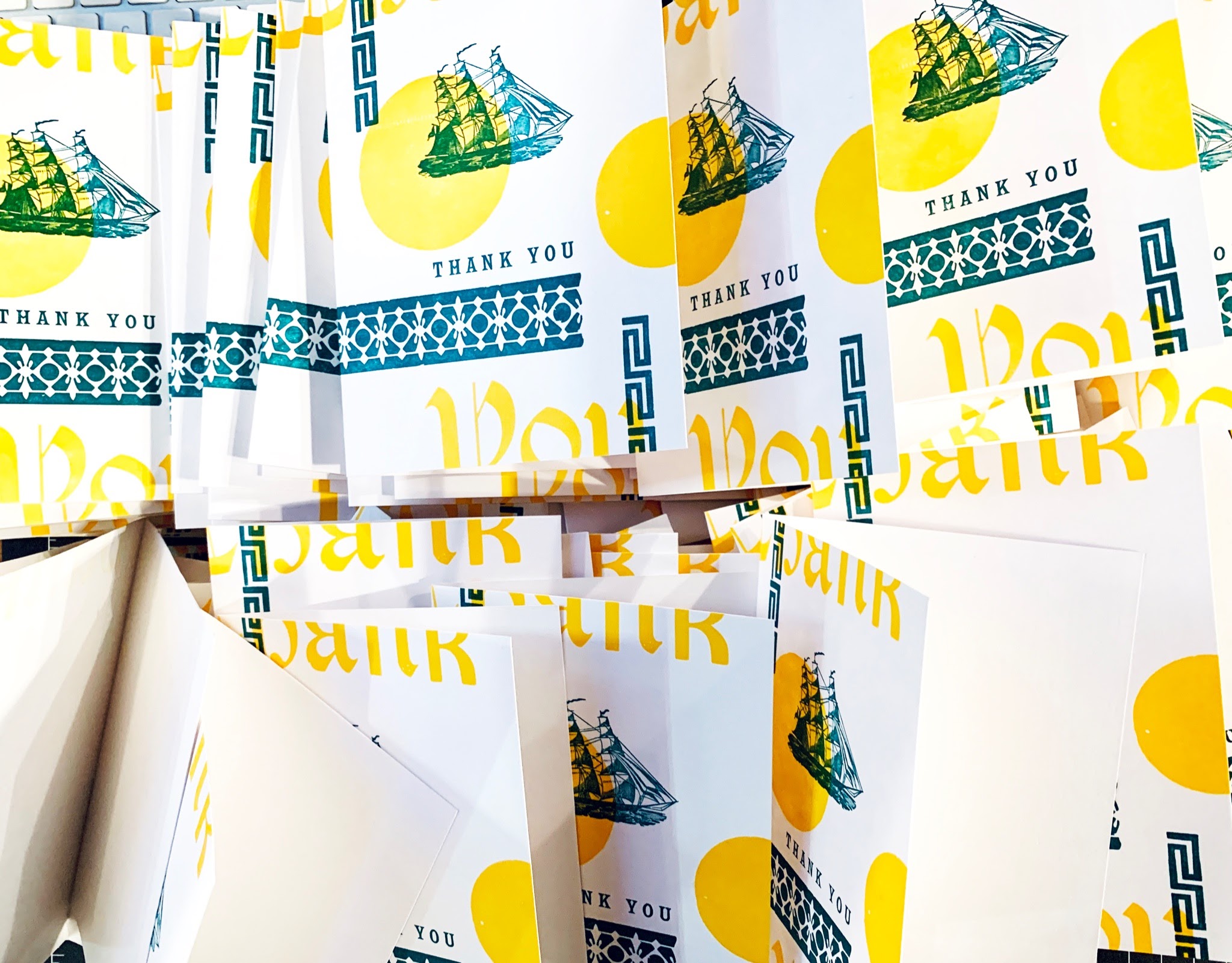
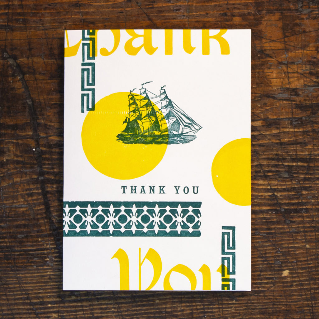
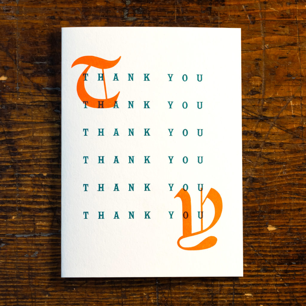
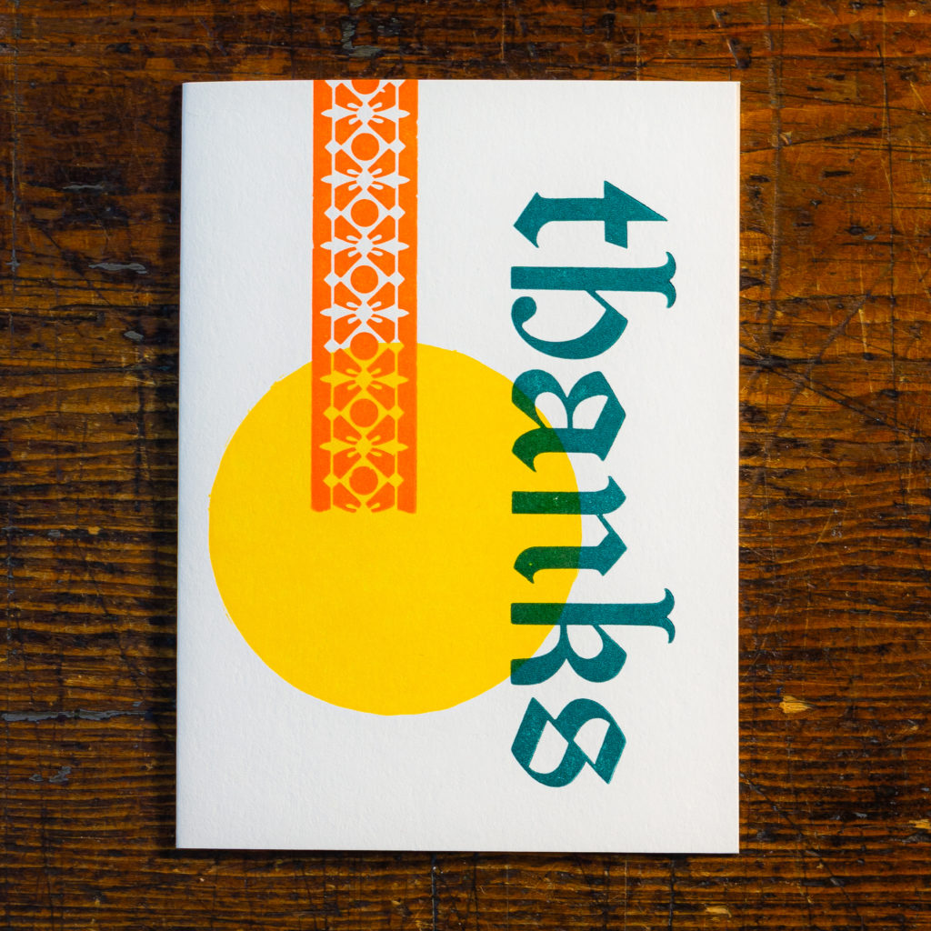
“Tall Ship” notecard by Rob Wilson and “Folio” notecard by Christine Picone, based on the Gutenberg Grid
Rob: “I wanted to keep the asymmetrical nature of this grid, with the addition of elements which bleed off the page to balance the composition. The green elements help define the traditional text area, while the yellow elements create an almost floating structure outside of the text box defined by the grid. This design was the most complex of my cards in terms of production, and ended up being printed in 3 runs through the press, 2 in yellow and 1 in green.”
Christine: “I referenced the format of the Gutenberg Bible and similar texts pretty directly here. Because we are working with a single phrase—”thank you”—rather than paragraphs of text, I used repetition and generous letter spacing to define the whole text area. The overprinted orange initials, a blackletter wood type from our working collection, mimic the hand-illustrated drop caps found in many early books and illuminated manuscripts. I have to admit, this is the grid I found most mystifying at first, but it is the design I’m proudest of now for the simplicity of the solution.”
Grid No. 2: 3×4 Grid
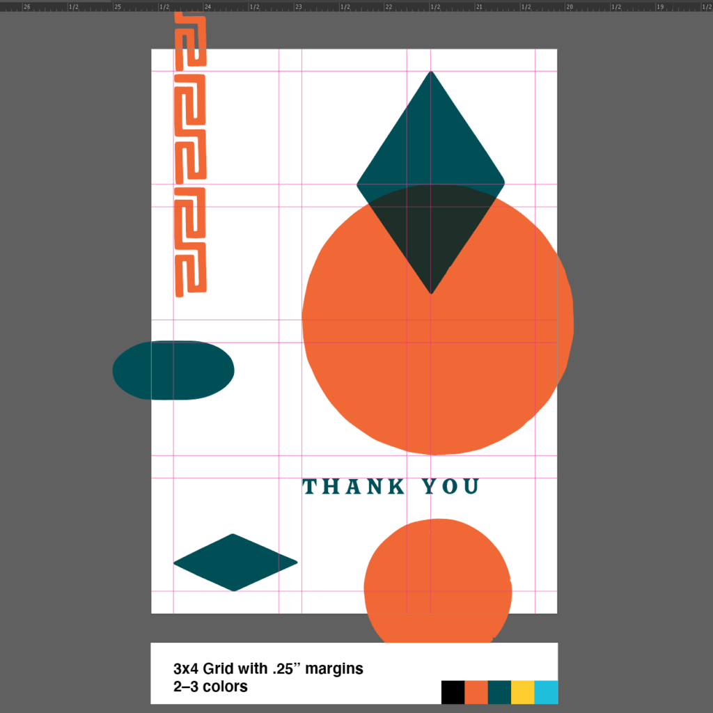
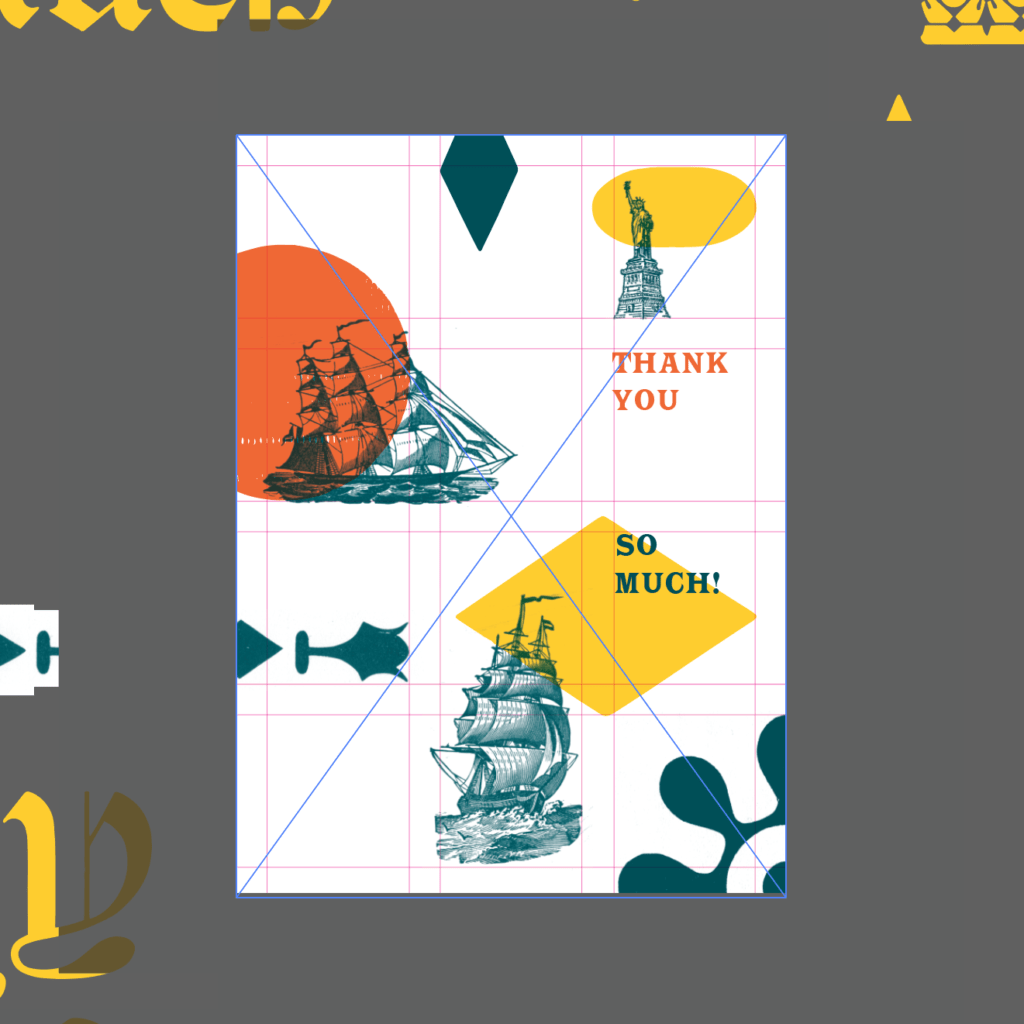
Our second grid is a simple 3×4 grid with quarter-inch margins. This grid structure separates the horizontal dimension into 3 equal units and the vertical dimension into 4 equal units. Adding margins allows for text and images to take up the grid units, leaving the margins as white space between elements. This grid is common in contemporary publication design, where many types of content—think photographs, illustrations, tables, headlines, and blocks of text—all must be organized on the page.
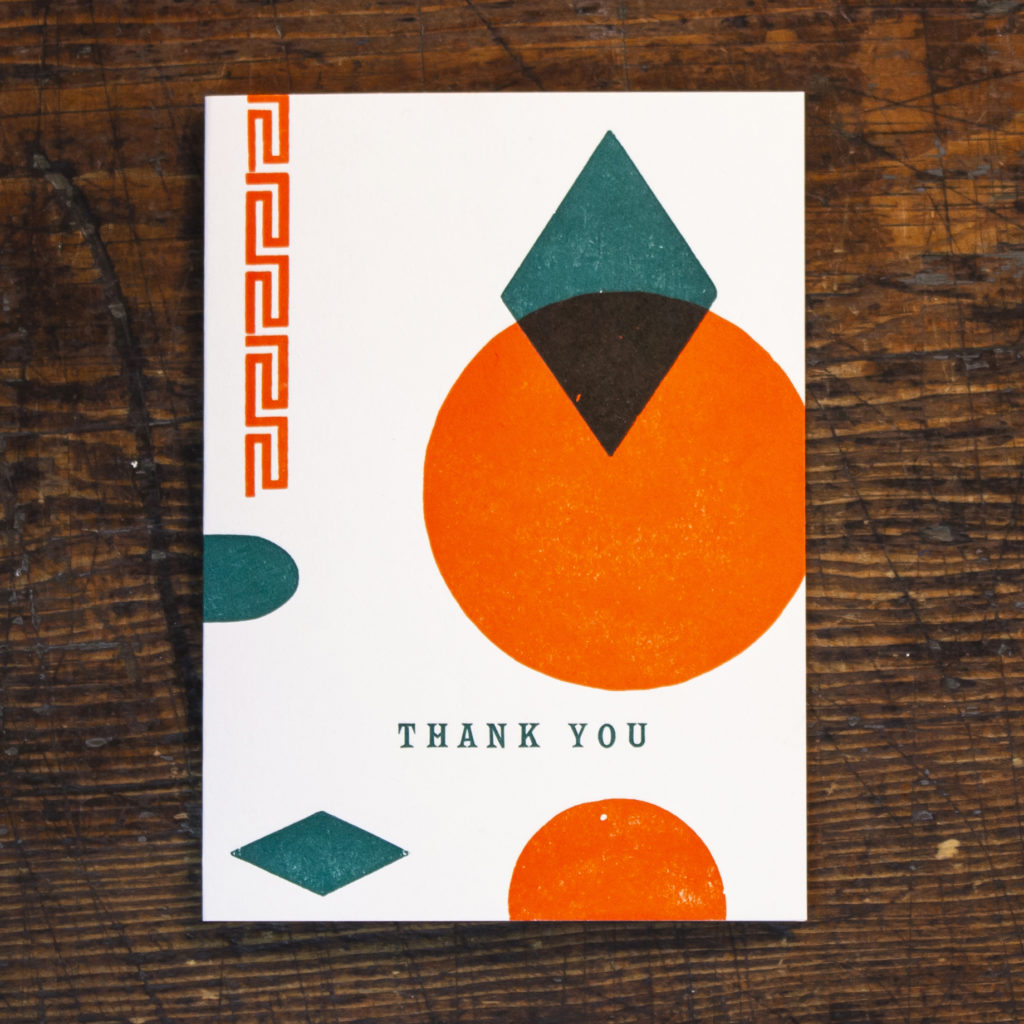
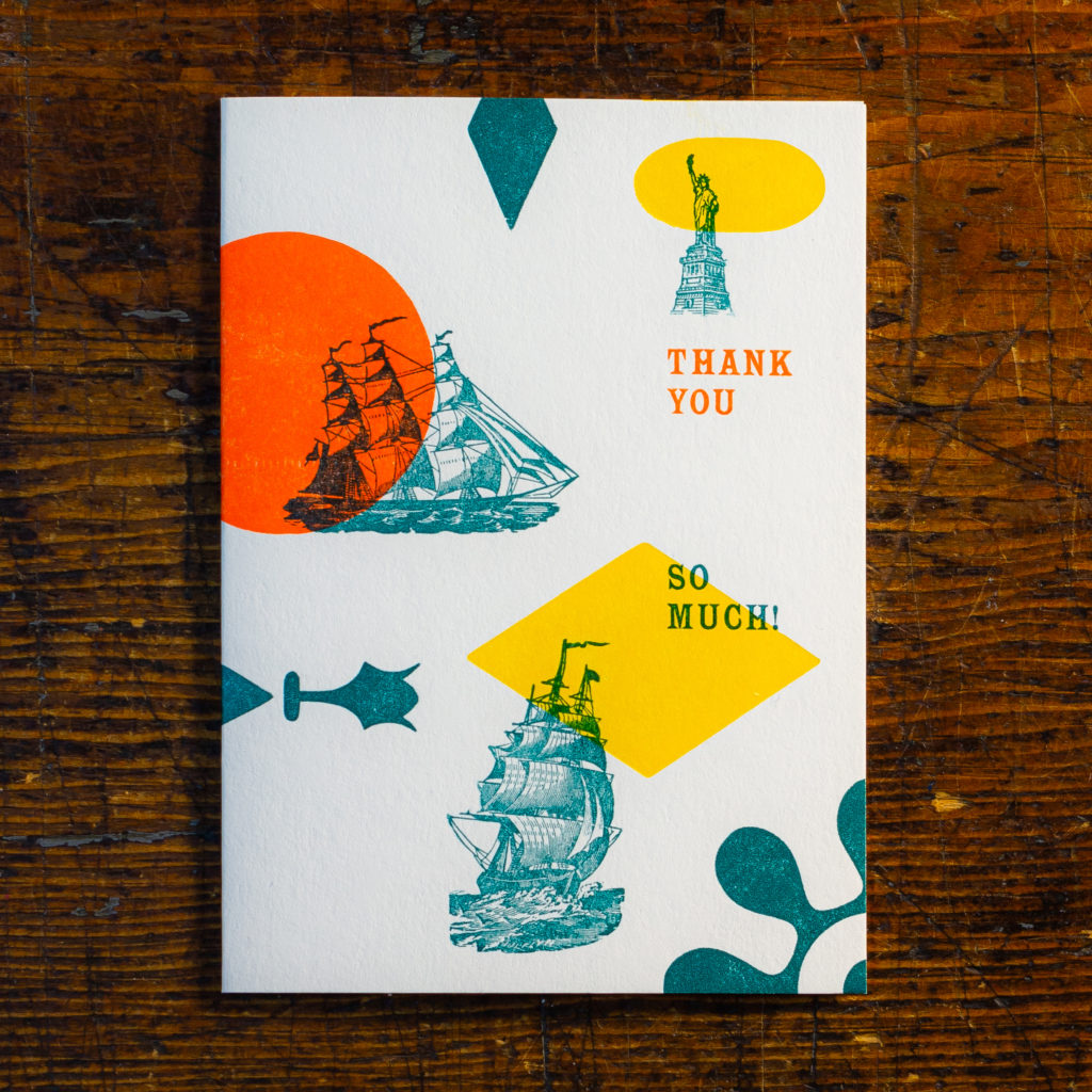
“Orange” notecard by Rob Wilson and “Port of New York” notecard by Christine Picone, based on the 3×4 Grid
Rob: “My initial thought was to create a bird’s eye view of an orange with a single leaf (a personal symbol of mine). This was accomplished with the large circle and diamond shape aligning with the gridlines. Additional elements were arranged around the grid to create a sense of repetition. The 3×4 grid, with it’s healthy margins, helps elements feel interconnected even if they don’t line up with each other. This helps a fairly disparate design feel grounded, and less floaty than if a grid structure wasn’t used.”
Christine: “This grid is so flexible, I knew I wanted to challenge myself to use as many elements as possible and let the grid do the heavy lifting to organize them. Due to our location in Lower Manhattan, I tried to depict an abstract New York Harbor in a playful way. The green shapes represent winds and land masses, and the orange circle behind a ship alludes to the sunset sails around the Statue of Liberty that are so popular at our museum.”
Grid No. 3: Vignelli Unigrid
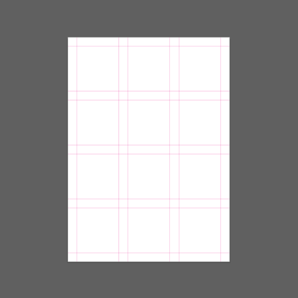
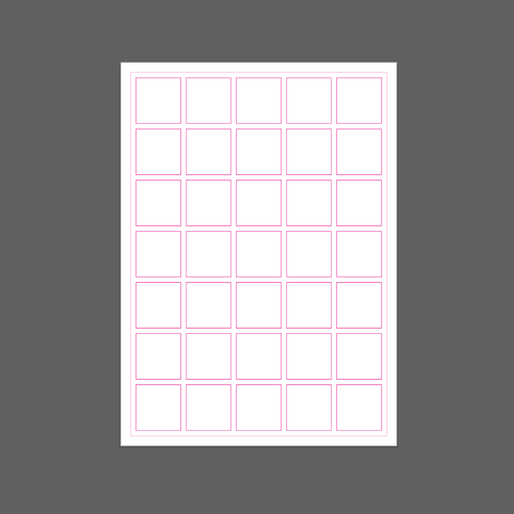
For our last designs, we chose to use a classic Modernist grid known as the Unigrid. It is a robust structure whose modular units can be applied in a vast range of contexts and sizes. This grid was developed for use by the National Park Service by a titan of Modernist graphic design, Massimo Vignelli. It has a fascinating history all its own, with much more to learn at National Park Service.
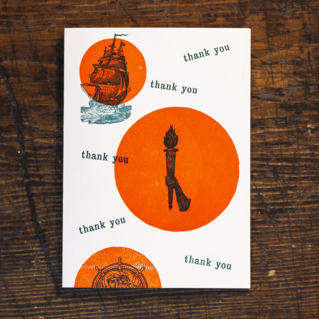
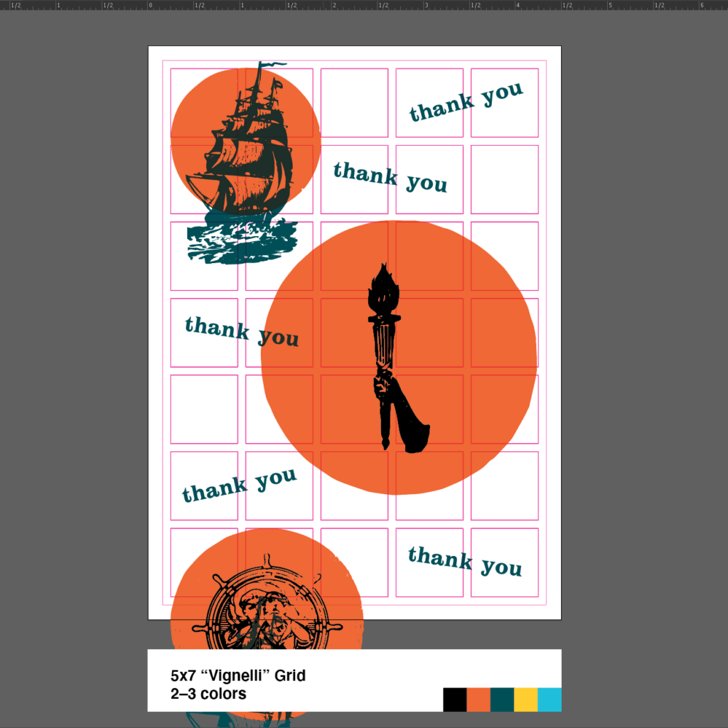
“Liberty” notecard by Rob Wilson and “Balance” notecard by Christine Picone, based on the Vignelli Unigrid
Rob: “This design is anchored on the 3 orange circles which most closely align to the grid. The images are then centered into the orange circles. Sometimes, when working in a tight grid, one of the best things a designer can do is intentionally break it. The “thank you” repeated text always fits centered into 2 grid units, but its baseline is shifted, leaving it feeling more organic and less rigid than the circles and imagery. The goal of doing this was to impart a sense of motion and playfulness into what was becoming a pretty rigid design system.”
Christine: “This was the most instinctive design of my bunch. I wouldn’t say this is a Modernist design, but in the Modernist spirit I deliberately chose to use a minimum of elements and tried to balance them nicely. Mr. Vignelli might be rolling in his grave due to the overprinting here, but I did it anyway. This is letterpress printing, afterall.”
A final note about this project: this way of working is definitely a more elaborate version of our usual methodology. While we often work with grid systems, we rarely do so this strictly when designing notecards! But it’s always good to challenge ourselves now and then. We find that we grow as designers this way, and we already came up with ideas for new projects during this exercise, so stay tuned! We are excited to be able to share another glimpse into our process, and as always, this series of cards is now available for sale at Bowne.co.
Together we can save the South Street Seaport Museum!
The pandemic has put the Museum at great risk of closing for good. We’re asking all those who love New York to step forward and join the die-hards who have kept the Museum alive through a myriad of challenges. Join the Our City, Our Seaport: Campaign to Save the Seaport Museum.
