
What Trade Cards Can Tell Us about the Old New York Social Scene
A Collections Chronicles Blog
by Kallen Mitchell, Collections and Exhibitions Management Intern
October 5, 2026
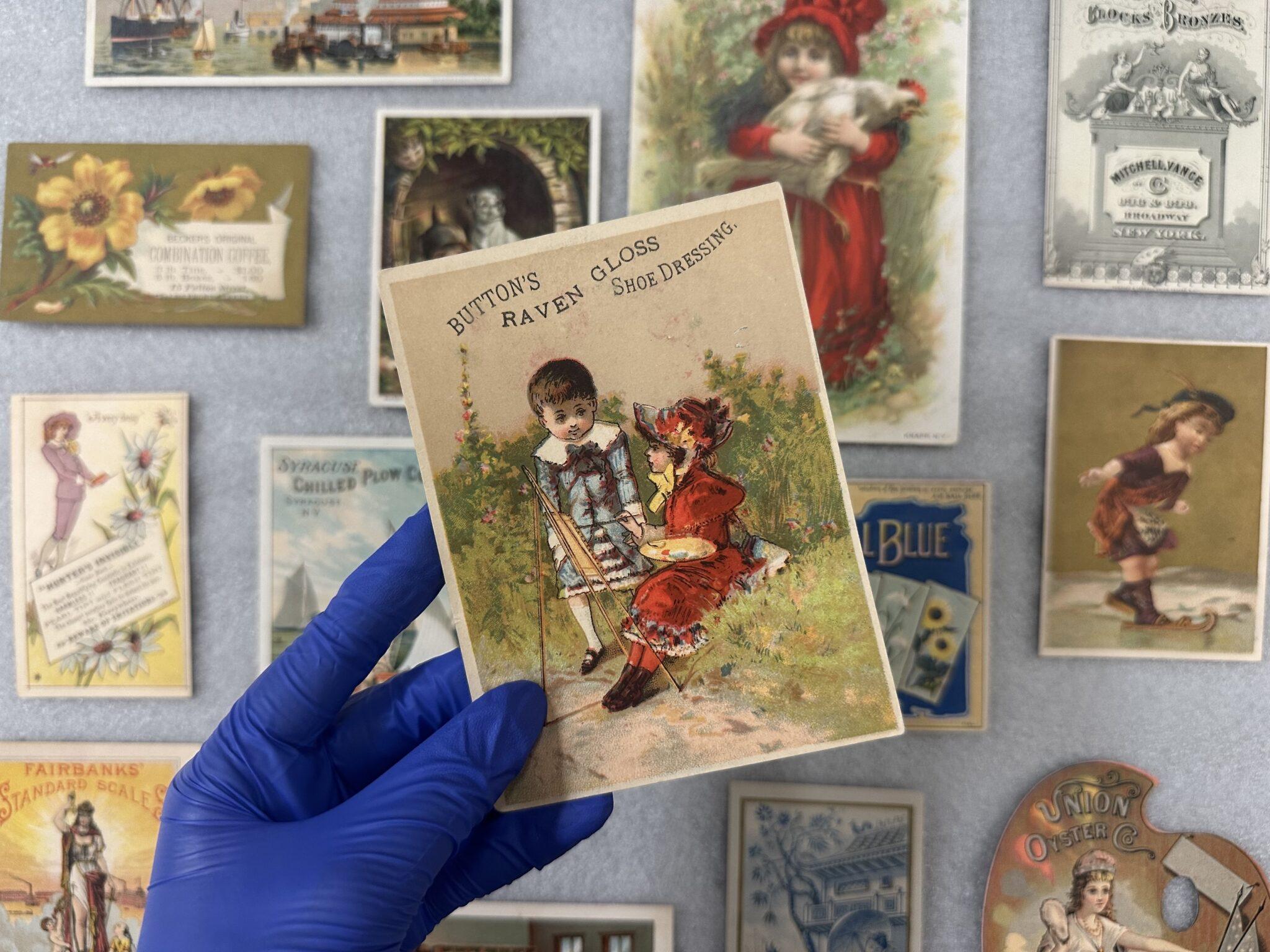
In the past few months here at the South Street Seaport Museum, my internship has revolved around a collections project featuring the Museum’s trade cards. These cards were an early form of advertisement that boomed in popularity in the late 1800s—though they were first seen about a century earlier—and continued well into the 20th century. They were distributed by both shopkeepers, who would hand them out in their stores or in the streets, and by wholesalers, who would place them inside the packaging of whatever product they were making. Cards would often include product information, business information, location of factories and retailers, and any other information that was needed to promote whatever it is they were selling. Small in size, usually around three to five inches long, you can think of them as an early form of a colorful and catchy business card.
While the information one can get about the 19th century New York City business scene from a trade card is invaluable, what piqued my interest was something different. Coming from an anthropological and archaeological background, I have always been fascinated by the origins of objects and ideas. Questions like “where did this thing come from?” or “how did this concept evolve?” are ones I ask myself almost daily walking around this deeply historic city.
Regarding the trade cards, you can ask those very same questions—and oftentimes, actually get an answer! One of the reasons this method of promotion boomed in the 19th century was the new technological advancements in chromolithography: as a result of this, lithography firms were popping up all over New York City. Proud of their creations, lithographers often put a signature at the bottom of the designs they were commissioned to make, which was kind of a secondary marketing for themselves. Nowadays, however, these signatures let us track who was making these beautiful and ephemeral works of art! Keep an eye out for these in the images to come.
Some lithography companies that I keep coming across from the Seaport in particular are Sarony & Major, The Donaldson Brothers, and the Hatch Lithography Company, to name a few. Though the lithographing community could be an entire blog by itself, from the drama of ownership transfers to the recognizability of their individual styles, I will only touch on its role near the end of this blog.
Apart from the questions of “how,” “where,” and “why,” we also have the “what.” What was printed on trade cards? What kinds of visual trends were there in these advertisements? This is where I will be focusing the first part of the blog, because the artistry, creativity, and thought that went into these pieces of ephemera is incredible and deserves its own recognition. In an attempt to showcase some highlights of our vast collection, I’ve selected a handful of cards that epitomize various themes we see across the medium.
To the Point
The first variety of trade cards are the more visually boring ones, though I feel like they are a good place to get the ball rolling. This trade card for H. P. Kirkham & Co., a company for ship repairs, has all you need to know about them and no other funny business: black ink, white background, maybe a little lettering flair, but that’s it. We know to find them at South Street near the Jackson Street Ferry (which, interestingly, is no longer a ferry stop). Straight to the point!
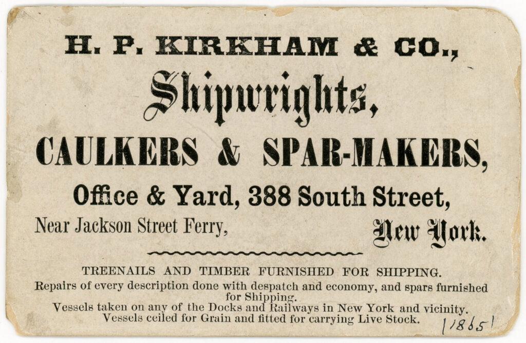
“H.P. Kirkham & Co. Shipwright Trade Card”, 1865. Trade Card Collection 2001.013.0016
Kids and Animals
I can’t tell you how often I’ve come across trade cards that use toddlers and family-friendly animals like cats and dogs, but I can show you a few examples. This advertisement is for Button’s Raven Shoe Gloss Dressing, which was a shoe blackening and preserving gloss. As you can see, there are two kids on the front who have presumably used the dressing, although who’s to say. This business utilized the back of the card to give all the details about their product and their logo. Eye catching on one side, informational on the other.
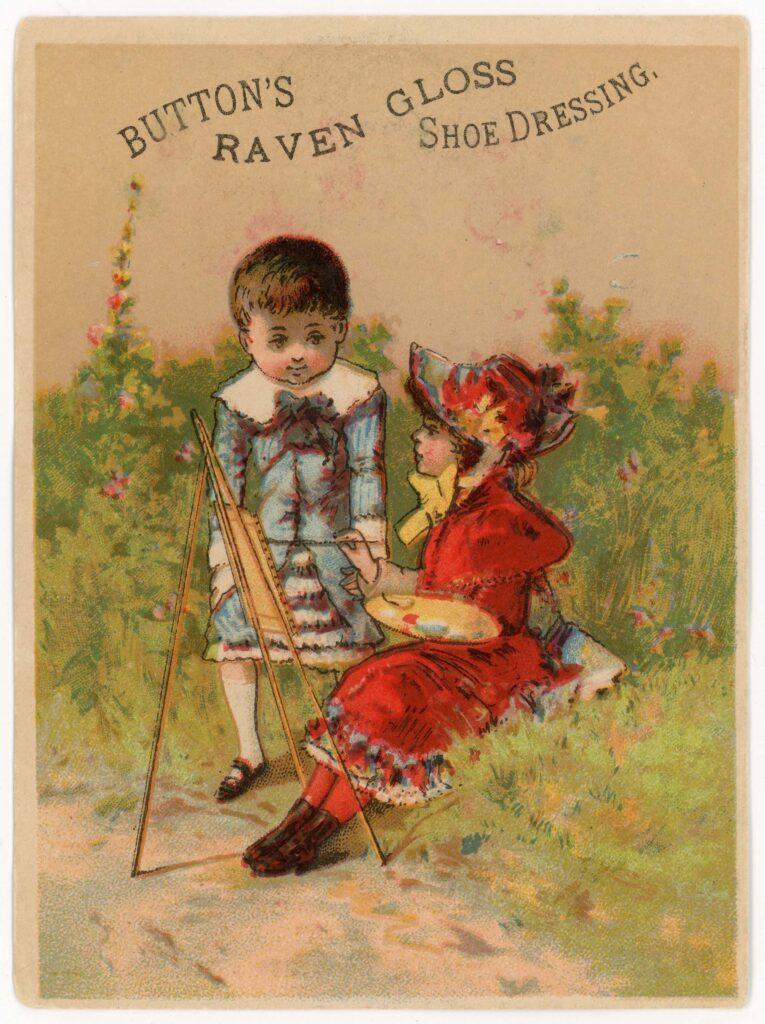
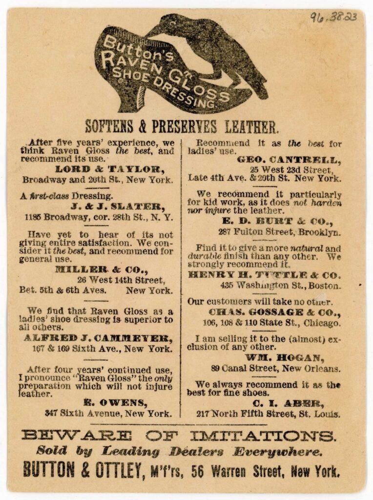
“Button & Ottley Manufacturers Trade Card”, ca. 1890. Trade Card Collection 1996.038.0023
Here’s a card that uses both children and animals. Genius! Alongside the two kids, lone dog, and giant candy, Ellinghauser & Co. Grocers chose to put their text and graphic on the same side of the card, and leave the back blank.
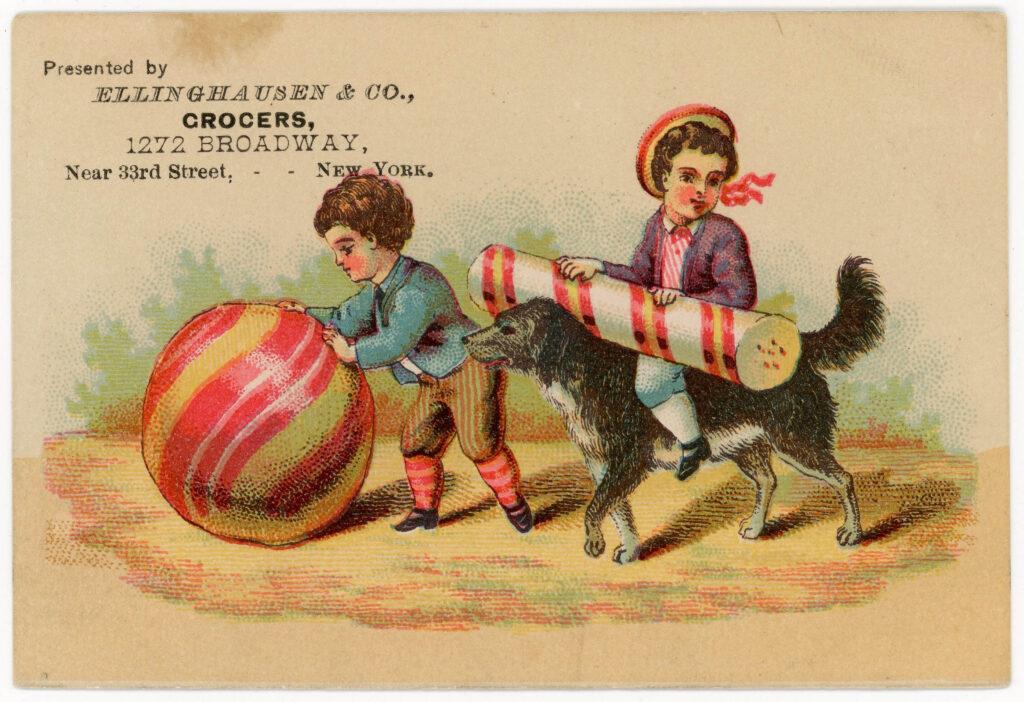
“Ellinghausen & Co. Grocers Trade Card”, ca. 1885. Trade Card Collection 1996.038.0004
Absolutely unrelated
These are some of my favorites. There’s a whole genre of trade cards where the image has absolutely nothing to do with the business—it is just a beautiful design.
Let’s play a game. What do you think this serene snowy cabin and delicate red and white flowers are promoting? Maybe a snow shovel? Something to do with the water mill? Nope! It’s an advertisement for guano! And what is guano, you might ask? Fertilizer, usually associated with seabird or bat excrement, but in this case this business derived theirs from fish, bone, and potash.
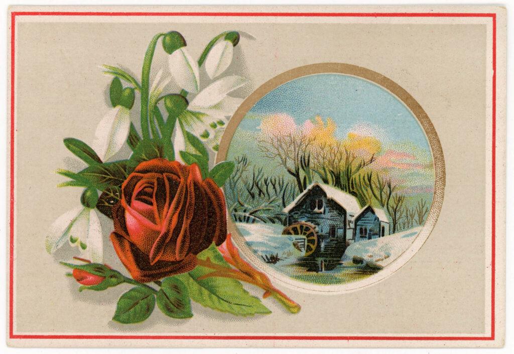
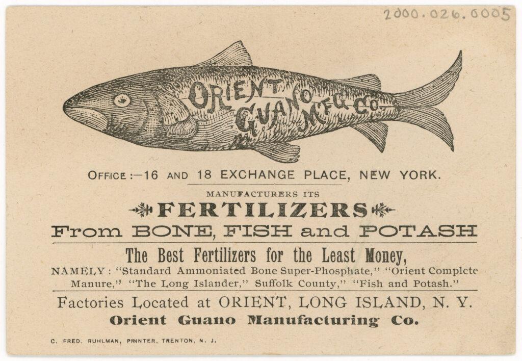
C. Fred. Ruhlman, printer. “Orient Guano Manufacturing Co. Trade Card”, ca. 1888. Trade Card Collection 2000.026.0005
Let’s play again. I’ve removed the answer on the front for our game’s purposes. This trade card is decorated with pretty white daisies, a fellow with a handlebar mustache and a purple suit reading a book, and the quote “A Very Daisy.” What could this be for?
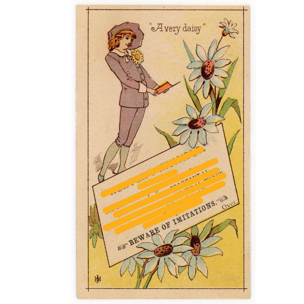
Not sure? I’ll give some more information. Through research, I found that the man in the card is named Archibald Grosvenor, a character from W. S. Gilbert’s (1836–1911) and Arthur Sullivan’s (1842–1900) opera called “Bunthorne’s Bride,” or sometimes called “Patience.” He is a poet.
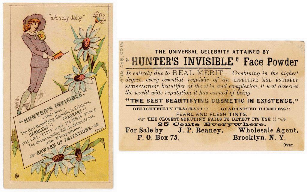
J. H. Bufford & Sons, lithography firm. “Hunter’s Invisible Face Powder Trade Card”, ca. 1885. Trade Card Collection 1996.038.0016
If you guessed that it was for cosmetic face powder, then you’d be right! If you didn’t guess that, don’t sweat it. That wasn’t my first guess, either.
Related and Recognizable
Jokes aside, many of the trade cards did have imagery directly related to their product. Here’s an advertisement for Bengal Bluing, a laundry product that adds a little bit of blue dye to cancel out yellowing or dirtiness in white clothing. Fittingly, their logo features a bengal tiger, and their products come in blue bottles, as you can see in the upper lefthand corner of the paper. The company chose to promote this imagery on the card by simply using their on-the-nose logo. This card happens to be one of my favorites in the collection, as you don’t often see a red so vibrant on these cards (Thank you J. Ottman lithography!)
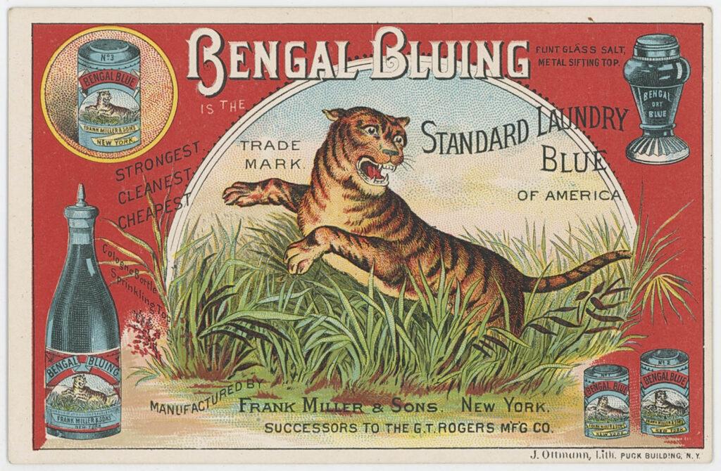
J. Ottmann Lith., lithography firm. “Bengal Bluing Trade Card”, 1885-1901. Trade Card Collection 1998.033.0005
Here’s another one. This promotion for the People’s Evening Line, a Hudson River steamboat transportation service that used to run overnight between New York City and Albany. More specifically the card is advertising its steamer Drew, which you can see right on the card.
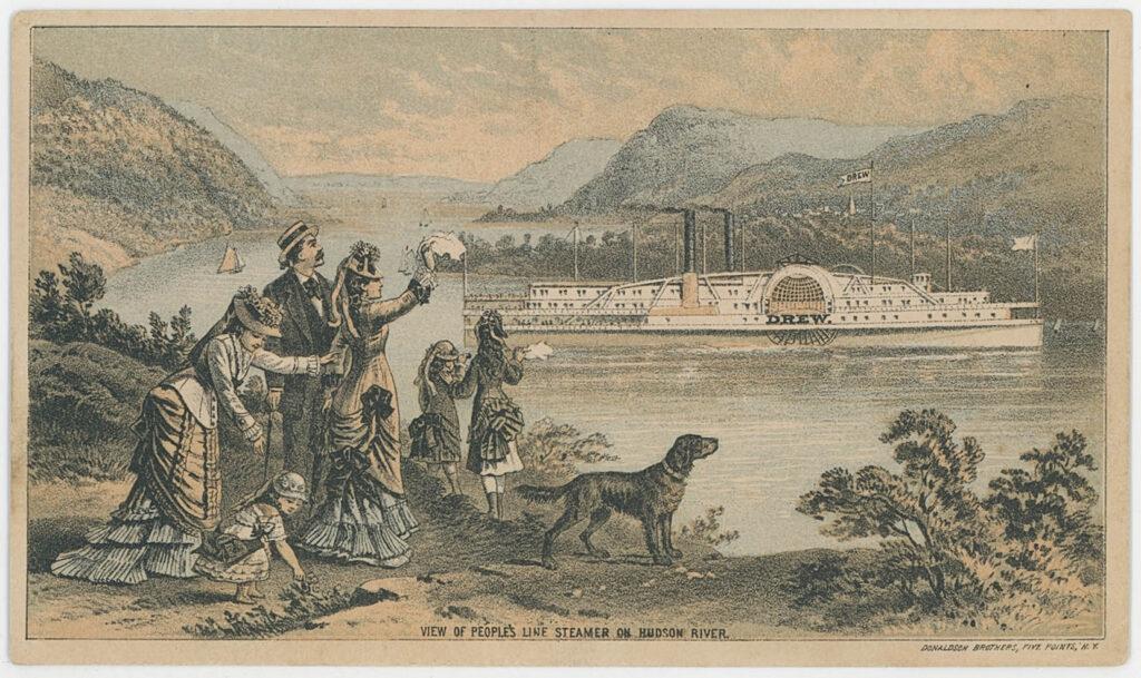
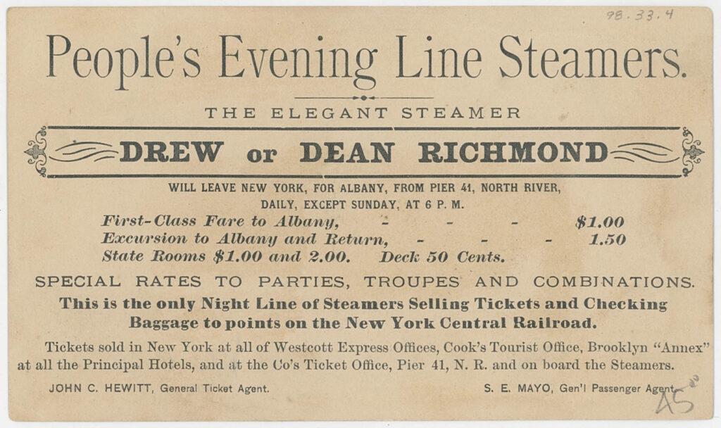
Donaldson Brothers, lithography firm. “People’s Evening Line Trade Card”, 1872-1891. Trade Card Collection 1998.033.0004
Jokes and Poems
Another fun category. Oftentimes, trade cards wouldn’t rely on visuals alone: humor and poetry were used to grab the audience’s attention, too. This piece is for Rogers, Peet & Co., though it does not tell us any information about what type of business they might be. The card features two men, one happy and one sad, and the phrase “another county heard from” makes the audience think that the men’s emotional states are due to some kind of election results. The back however, gives a long winded explanation about how the men are actually not emoting due to election results, as was implied. Instead, one of them is happy because he bought his and his family’s clothes at Rogers, Peet & Co. clothing house, while the other is sad because he did not.
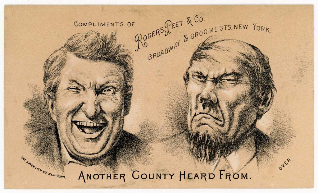
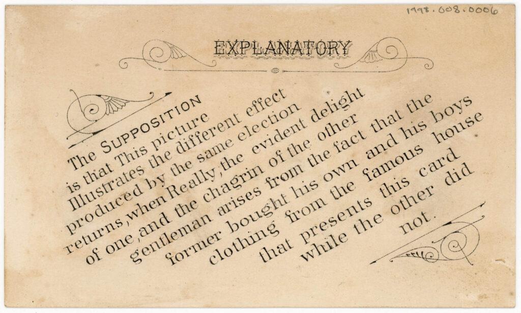
The Hatch Lithography Co., lithography firm. “Rogers, Peet & Co. Trade Card”, ca. 1880- ca. 1882. Gift of Peter Neill 1998.008.0006
In my opinion having to explain a joke makes it slightly less funny, but I appreciate the innovative approach by the company. The creation date for this object was narrowed down to most likely between 1880 and 1882 by looking at the lithographers’ signature, but perhaps the comedic theme of election results indicates that it was made closer to 1880, when James A. Garfield (1831–1881) beat Winfield Scott Hancock (1824–1886) in a very tense presidential election.
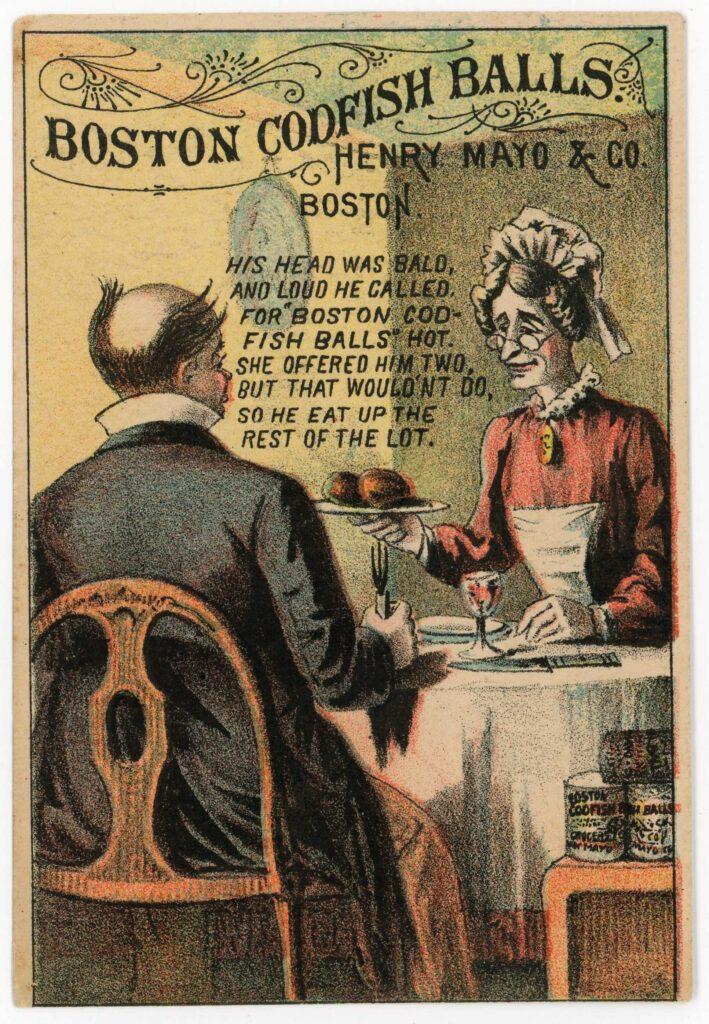
Like jokes, poetry was used as a tool to make advertisements memorable. The poems would range from being a short four-line verse to having multiple large stanzas, with the latter usually telling an in-depth story.
This design utilizes a quick poem with a catchy rhyme scheme to advertise for Henry Mayo & Co.’s Boston Codfish Balls, making sure to highlight the delectability of the dish and insisting that eating two of them is not enough.
“Henry Mayo & Co. Trade Card”, 1878-1884. Trade Card Collection 2000.026.0001
Fun Shapes
Despite what we have seen so far, not all trade cards were rectangular! In fact, many of them would utilize fun shapes as their form. Though it is not entirely clear why, Union Oyster Co. chose the shape of a paint palette, going so far as to include the hole in the middle where an artist’s thumb would go through. The woman in the image holds an oyster shell, adding some needed relevancy. The back gives more information about the local seller of the product.
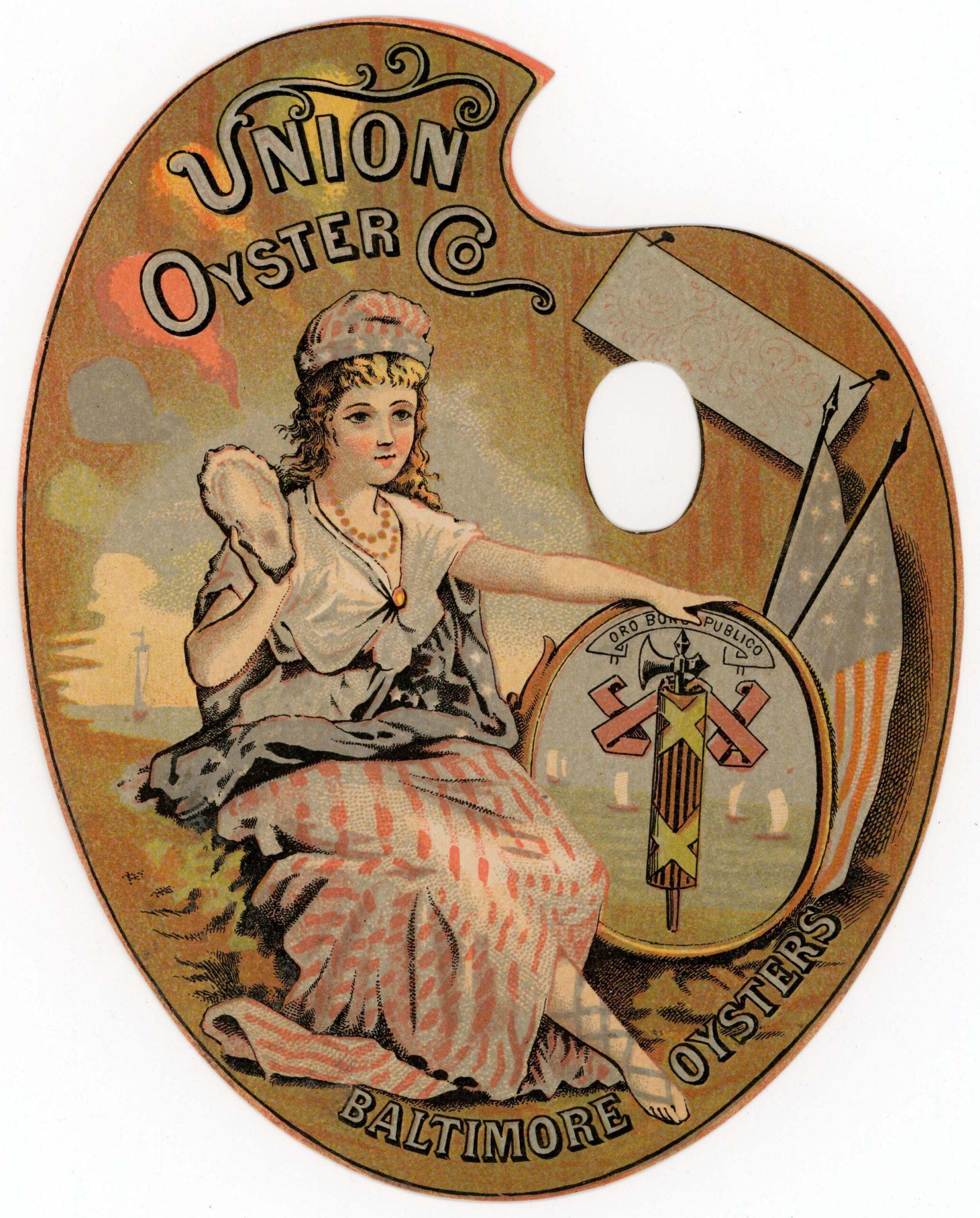
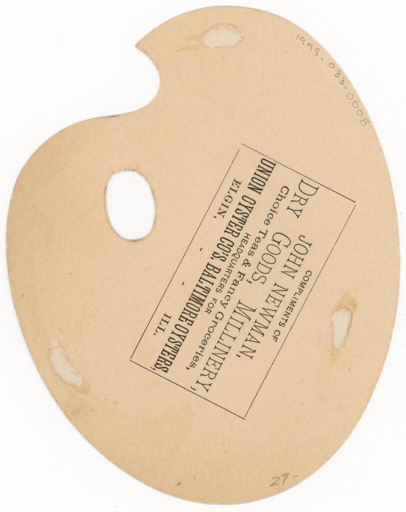
“Union Oyster Co. Trade Card”, 1878-ca. 1900. Trade Card Collection 1998.033.0008
This advertisement for Mellin’s Cod Liver Oil is aptly in the shape of a codfish! No fuss here, but immediately eye-catching, and a crowd-pleaser in the collection.
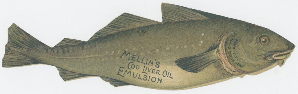
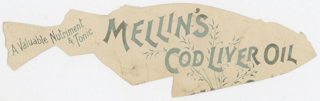
“Mellin’s Cod Liver Oil Trade Card”, ca. late 19th century. Trade Card Collection 1999.005.0009
Self-Reflecting
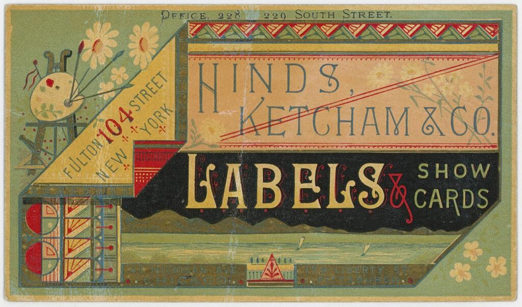
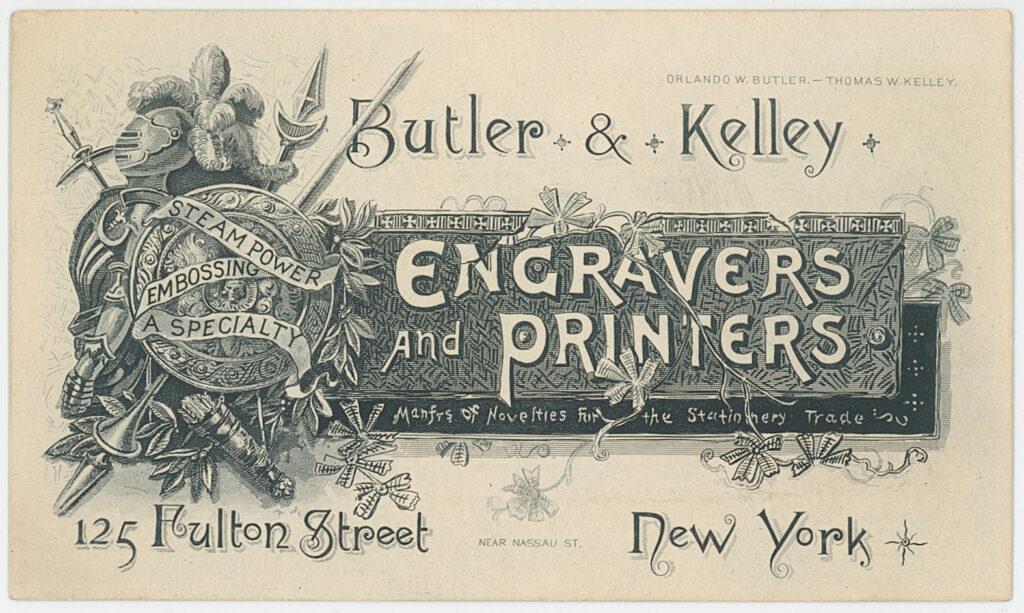
Perhaps the most interesting variety of trade cards to me are those that lithographers and printers made to promote themselves. I have found that these tend to be some of the most beautiful and intricate of them all, as artists would pull out their greatest tricks to showcase their abilities.
I want to add the disclaimer that none of these have the standard signature in the bottom corners that list them as makers. The assumption is that they are made by the subject, as it seems odd to think a lithography business that makes trade cards would have other lithographers make their own cards. Keeping this in mind, let’s look at some pieces advertising for lithography.
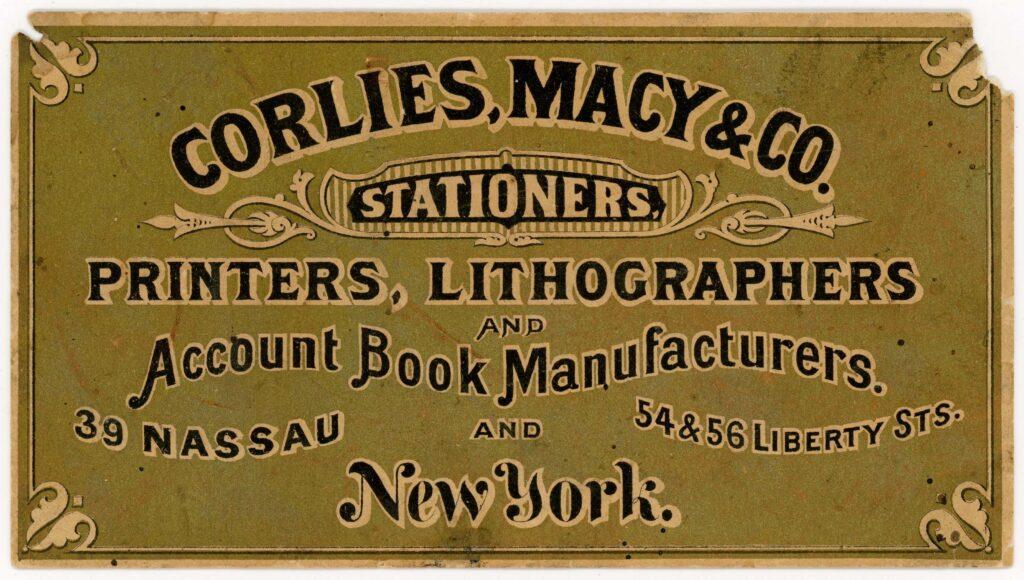
Left: “Corlies, Macy & Co. Stationers Trade Card”, ca. 1885. Gift of Peter Neill 2000.016.0003
Center: “Hinds, Ketcham & Co. Trade Card”, ca. 1880s. Trade Card Collection 2000.031.0005
Right: “Butler & Kelley Engravers and Printers Trade Card”, early 20th century. Gift of Peter Neill 2000.001.0001
The first card is made for Corlies, Macy & Co. Stationers. Though hard to see in the scan, the background of this card is a rich, iridescent gold that reflects and changes colors in the light. It is nearly holographic.
This next design is for Hinds, Ketcham & Co., and shows off the business’s various typefaces, colors, intricate patterns, and fine line work. This final work showcases not colorful ink, but instead the business’s ability to create intricate designs and detailed images. From the feathers in the knight’s plume to the fine shadowing of the words “New York,” Butler & Kelly went all out on this one.
From these trends and visuals, we get insight into the culture of the 1800s. We can learn about their sense of humor, their values, what kinds of products they were using or what was considered innovative. Trade cards are truly fascinating and perhaps underutilized primary sources into what life used to be like.
What We Can Learn About New York From Trade Cards
Researching this collection the past few months has taught me more about the history of New York City than I anticipated. I am often coming across connections between people and businesses, digging up foundations of modern New York life, or uncovering long forgotten drama. The rabbit holes that these trade cards send you down as a collections specialist and history enthusiast are deep.
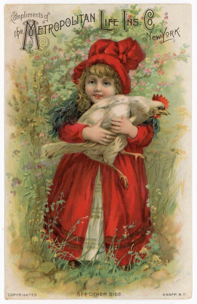
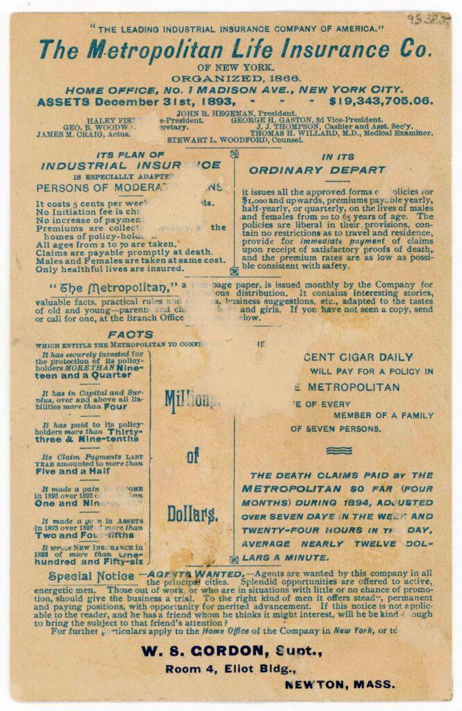
Knapp Lith. Co., lithography firm. “The Metropolitan Life Insurance Co. of New York Trade Card”, 1894. Trade Card Collection 1996.038.0027
Let’s use this piece as a case study. This advertisement is for the Metropolitan Life Insurance Company of New York, which would later be called MetLife Inc.—yes, that MetLife.
Look in the bottom right corner for the lithographer’s mark that says “Knapp N.Y.” This is in reference to Joseph Palmer Knapp (1864–1951), who worked as a lithographer in the late 1800s, following in his father Joseph Fairchild Knapp’s (1832–1891) footsteps.
Joseph F. Knapp also happens to be the second president of Metropolitan Life Insurance! He died in 1891, and this card is dated around 1894 based on the information on the back of the card. It, then, says something interesting about the relationship between the Knapp family and MetLife that they would continue to use Knapp’s son for their lithography purposes even after his father’s death.
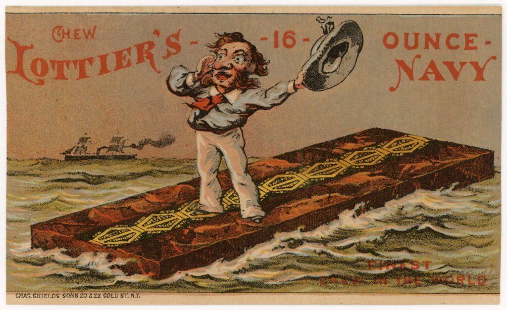
Chas. Shields’ Sons, lithography firm. “Lottier’s Tobacco Trade Card”, ca. 1878-1885. Gift of Peter Neill 1997.027.0003
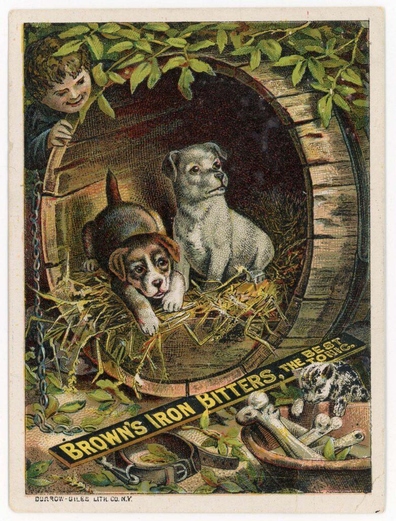
With the help of the Museum of the City of New York (MCNY), I have also found that at least two different lithography firms worked out of the same locations at different time periods. The lithographer’s signature here references Charles Shield’s Sons at 20 and 22 Gold Street. By utilizing MCNY’s public collections online database, I found that Burrow-Giles Lithographic Company was also located at this location for some time. Here is one of their trade cards in our own collection, printed without the location on the maker’s mark. And more puppies, of course.
The final example I’ll share of what these pieces of ephemera can reveal is regarding a lawsuit between two lithographers whose work is represented in the Museum’s collections.
In 1884, Burrow-Giles, which was just discussed, and Napoleon Sarony (1821–1896), a lithographer and photographer who worked closely with Joseph Fairchild Knapp when they were operating under the lithographing business “Sarony, Major & Knapp,” were wrapped up in a lawsuit that established a copyright precedent regarding photographs.
Sarony, had posed and photographed author Oscar Wilde (1854–1900), signing the photograph with his name.
In short, Burrow-Giles was reproducing the photo without consent, and Sarony was less than thrilled about it. The verdict was that photographs were subject to copyright protection.
Burrow- Giles Lithography Company. “Brown’s Iron Bitters Trade Card”, ca. 1885. Trade Card Collection 1996.038.0005
Conclusion
The fun thing about trade card research is that you never know what stone you’re going to accidentally turn over or what connection you’re going to make. One card may be a lighthearted advertisement for some type of textile brand, while the next will be a heavy, serious one for fire insurance. The further I get into our collection, the more knowledge I stow away in my own brain’s repository about facts, people, and locations mentioned on the cards or through research, which means I am often retroactively connecting cards back to earlier ones. I’m sure there’s connections between the cards I’ve been through and the ones I have yet to research that I don’t even know about yet!
While it may be tempting to take these cards at face value as purely advertisements, it is obviously far more rewarding to frame them as clues towards a larger, interconnected map of the past by picking out small and perhaps overlooked details. These tiny, notecard-sized pieces of paper can reveal so much about the City’s history, in ways never expected. How fascinating is it to know that there were not only perhaps feelings of ill will between rival lithography companies, but also allegiances between lithographers and their loyal customers that transcended even death? Or to think about broader advertising trends and see gradual advancements in lithographic technology? Considering the trade card collection as a whole instead of as individual parts lets us paint a broader and more thorough picture of life here over 150 years ago.
Around 200 trade cards from our collections have recently been added to our free and public Collections Online Portal. I encourage you to look through them yourself and see what kinds of connections or patterns you can find. Don’t be scared to go down a research rabbit hole!
Additional Readings and Resources
Trade Cards:
Hubbard, Phillippa. “Trade Cards in 18th-Century Consumer Culture: Circulation, and Exchange in Commercial and Collecting Spaces.” Material Culture Review 74, January 01, 2012.
https://journals.lib.unb.ca/index.php/mcr/article/view/20447/23603
“Ten Things To Know About Trade Cards.” Pre War Collector, October 30, 2024. https://prewarcollector.com/2024/10/30/ten-things-to-know-about-trade-cards/.
“The Art of American Advertising: Trade Cards.” Baker Library Historical Collections. https://www.library.hbs.edu/hc/artadv/trade-cards.html
“Trade Cards: A Short History.” Cornell University Library. https://exhibits.library.cornell.edu/tradecards/feature/trade-cards-a-short-history
Research:
Burrow-Giles Lithographic Company v. Sarony, 111 U.S. 53 (1884), Justia, https://supreme.justia.com/cases/federal/us/111/53/#top
“Interior of one of Cowperthwait’s 15 Show Rooms.” Museum of the City of New York, Collections https://collections.mcny.org/asset-management/24U39Y8LV8U?FR_=1&W=1731&H=849
“Joseph Fairchild Knapp.” Find a Grave https://www.findagrave.com/memorial/57611821/joseph_fairchild-knapp
Lasky, Jack. “Metlife, Inc.” Ebsco, 2022 https://www.ebsco.com/research-starters/history/metlife-inc/
“Patience.” Gilbert and Sullivan Archive, August 21, 2011 https://gsarchive.net/patience/html/intro.html
“Sarony, Major & Knapp.” American Historical Print Collectors Society, https://ahpcs.org/publisher/sarony-major-knapp/
Van Besien, Bart. “Copyright on Photographs under Early US Law.” Finnian Columbia, August 01, 2023 https://finniancolumba.be/en/copyright-photographs-early-us-law/